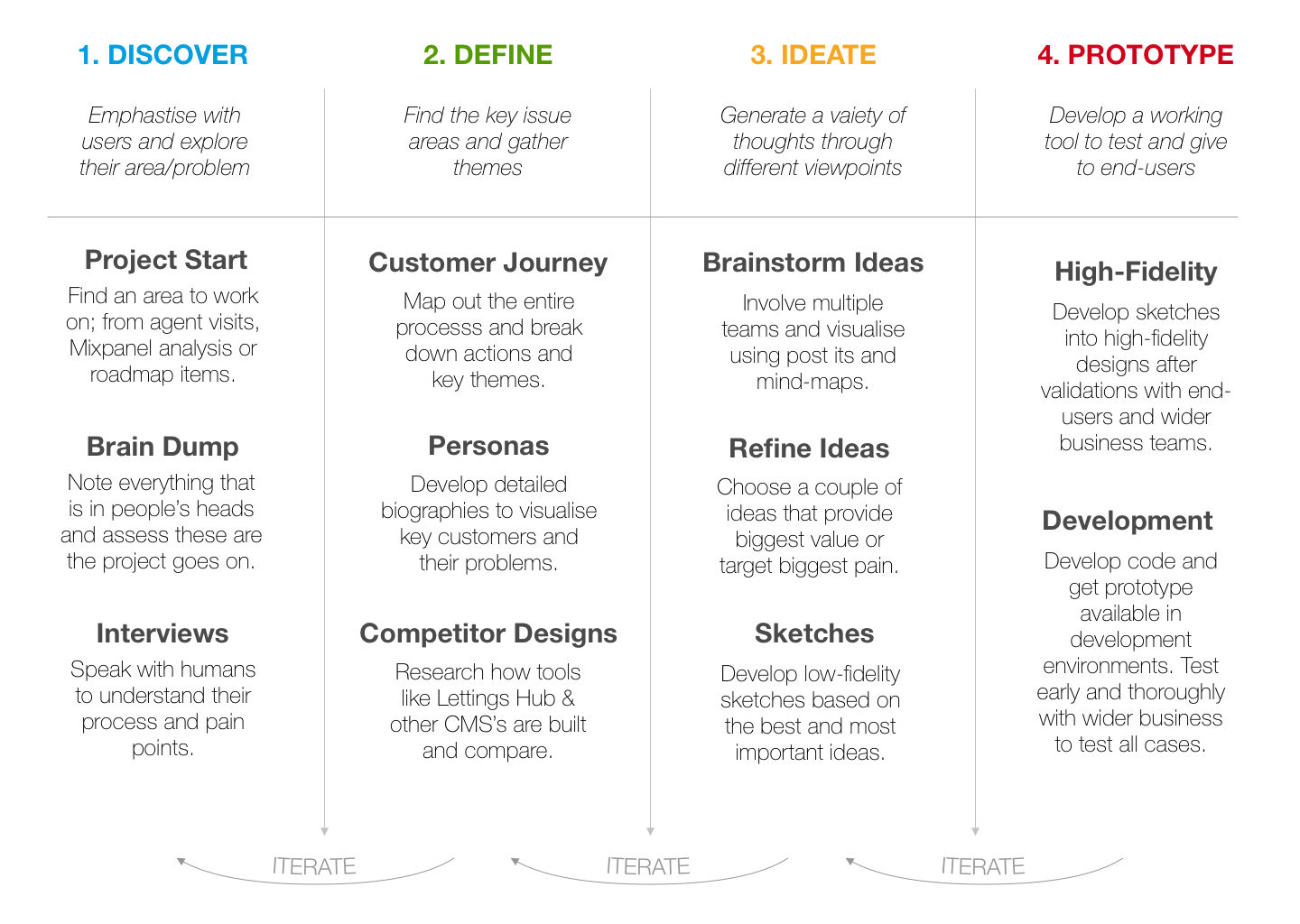
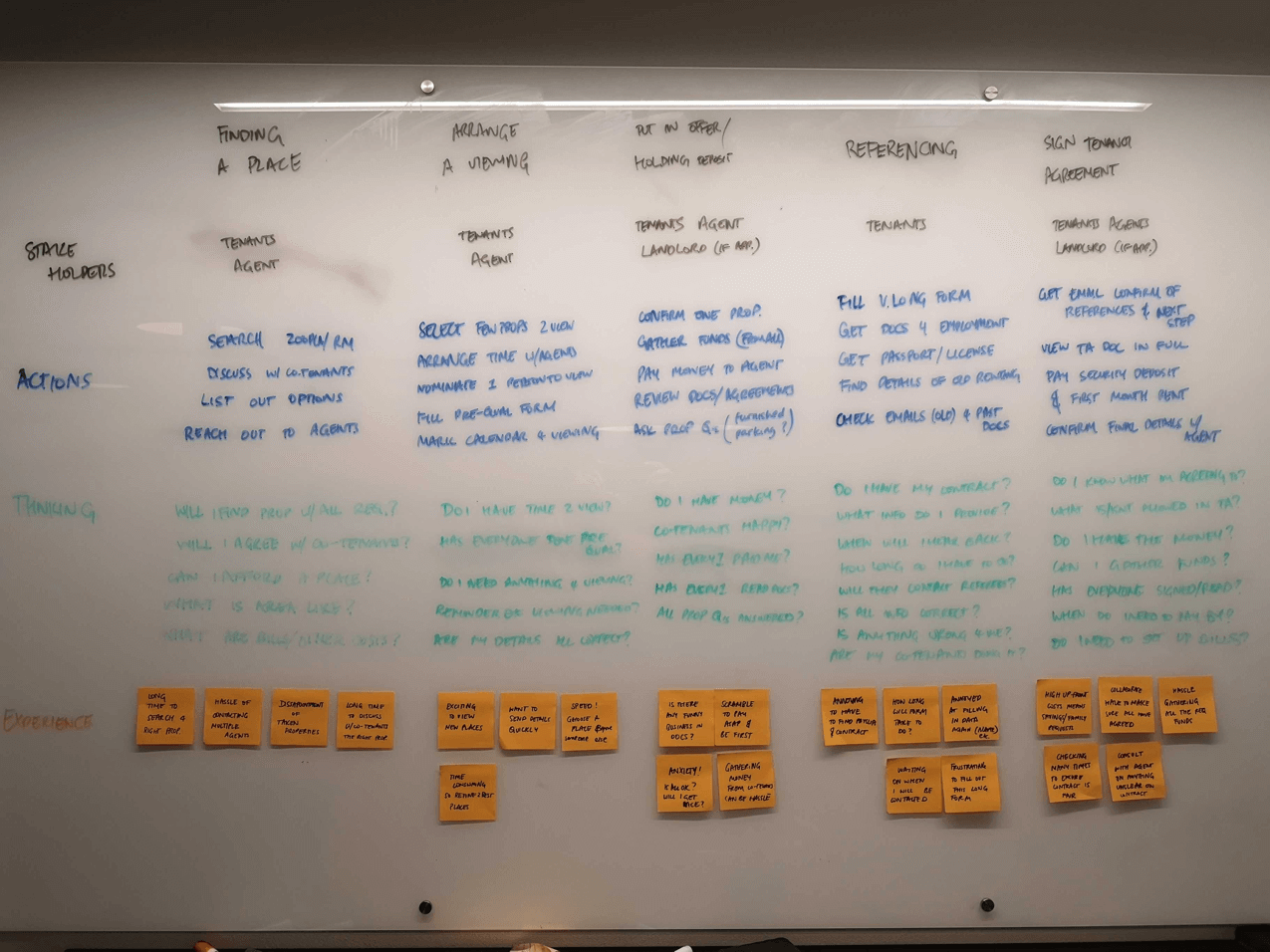
After this, I moved onto the ideation phase, specifically starting with converging. I facilitated brainstorms with different departments within the business: Customer Success, Support and Product.
This helped to get everyone’s views on what the ideal experiences could look like, what would
we want if we were moving properties. We noted down everyone’s thoughts
(link) and took away some key themes:
- Clear initial email explaining Goodlord.
- A more conversational journey throughout for tenants.
- Making Goodlord a central place to come back to (redirect to homepage at each stage)
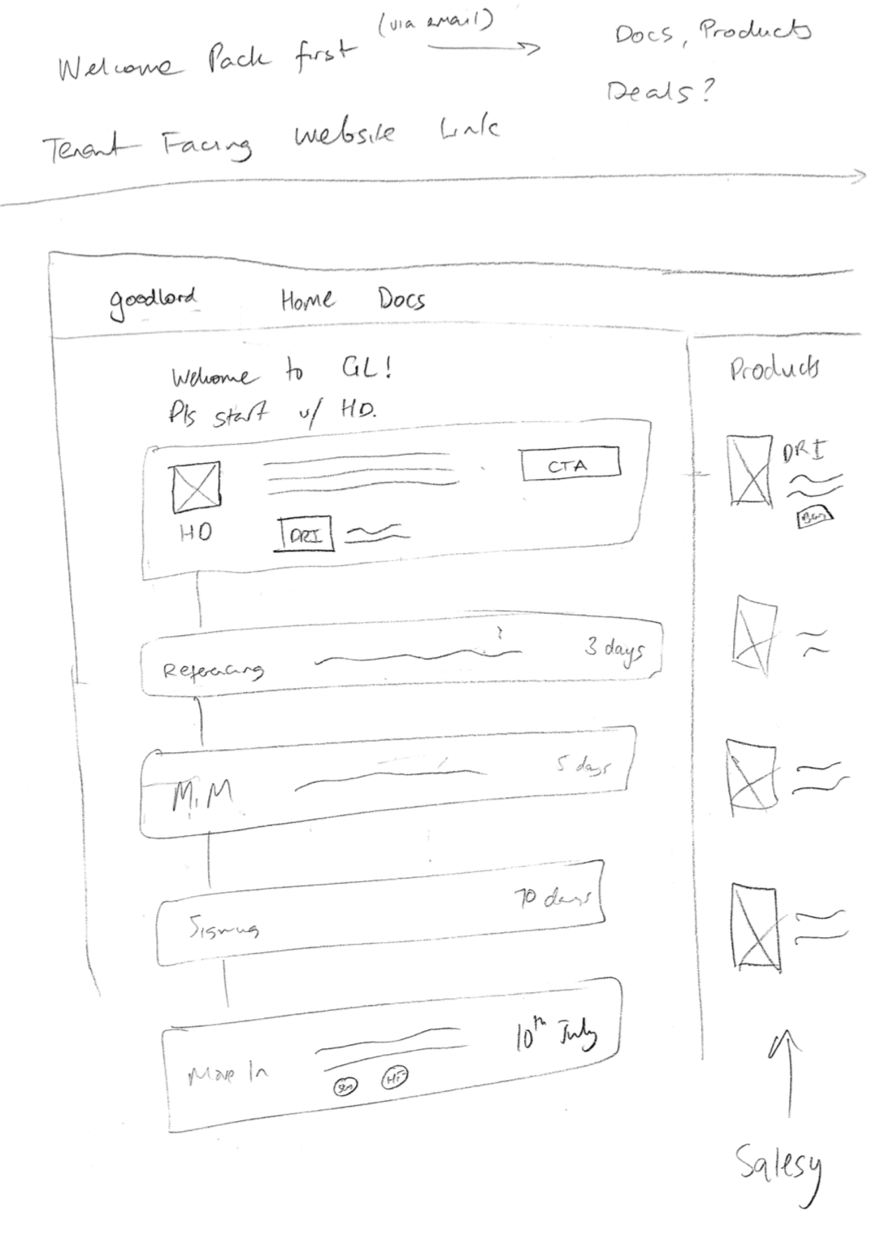
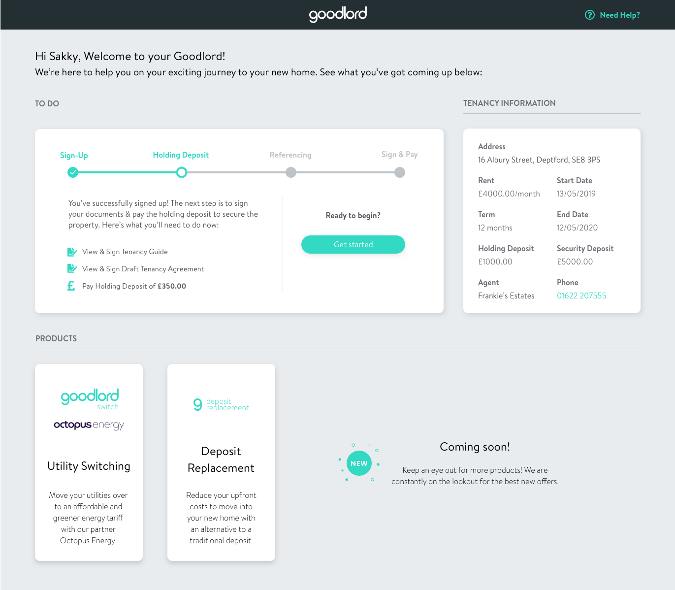
I then began to sketch out some ideas of what the tenant homepage could look like. Below is a sketch that shows the different stages of the journey (giving visibility), marketing of products (revenue opportunity) and upload of documents (contributor to a large percentage of support tickets).
This sketch addressed a few of the key themes that were found in brainstorms. From a technical standpoint, the feasibility of the design, even at this early stage, was discussed with developers. Getting an understanding of our technical limitations, specifically our back-end architecture was
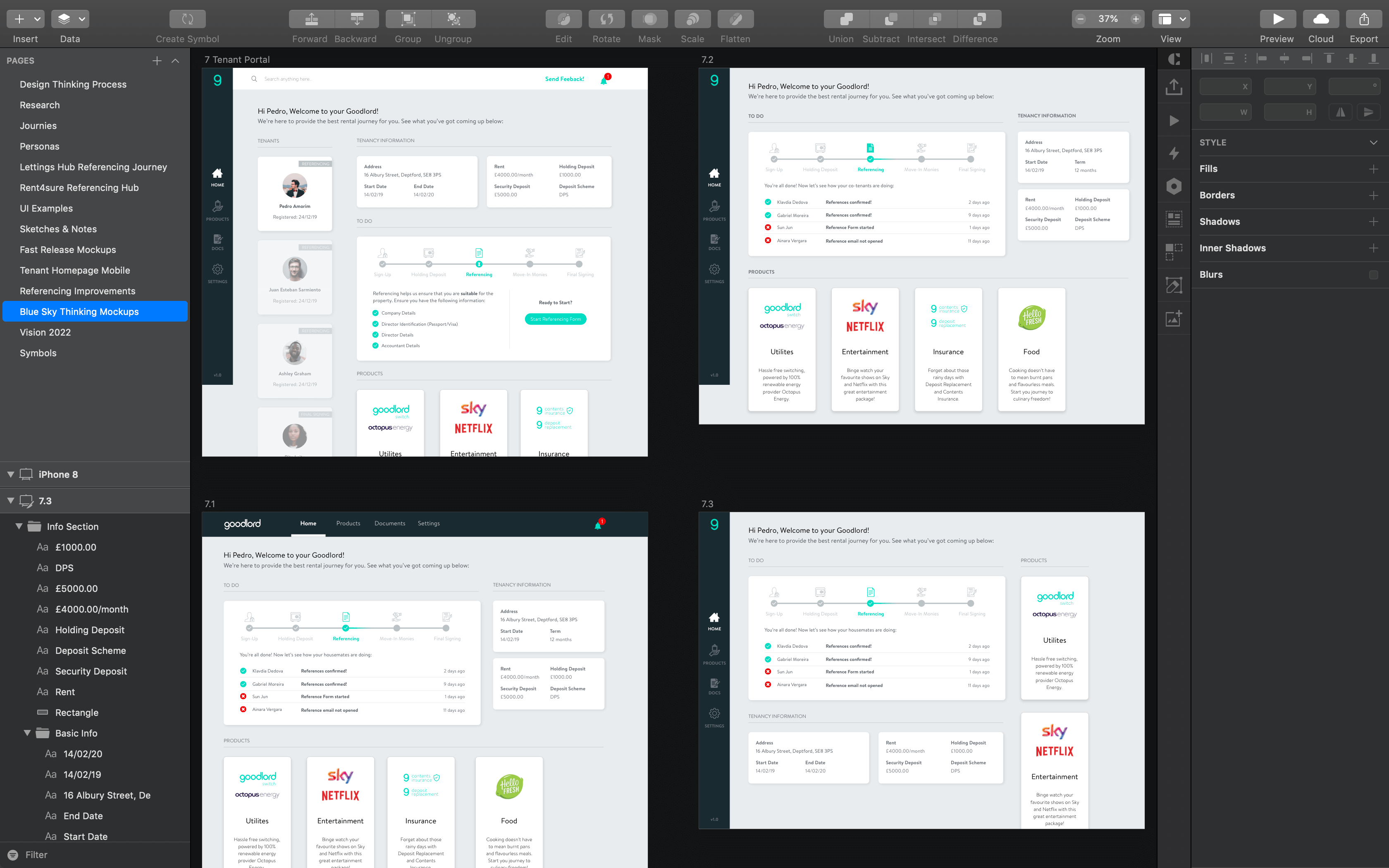
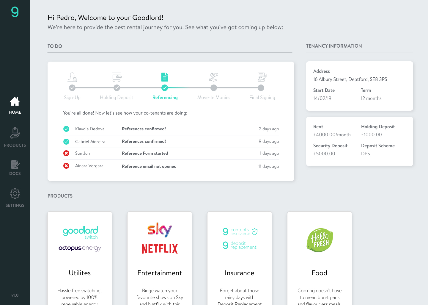
crucial to developing what a first iteration (v1) could look like and feature.More sketches were done (click on the image and go through the artboards), and I used our very collaborative kitchen space to do some guerilla testing, getting feedback from my colleagues on what they thought about certain layouts and designs.

.png)